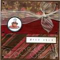
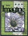
I loved the way the colours from the challenge blended together in this flower. I used my blender pen with my ink pads for a soft look, and then finished off with the clear Sakura Stardust pen (becoming a definite staple in my supplies!). I didn't have any ribbon that worked well this at all (must stock up! - getting desperately short of good options!). My solution was to use a contrasting panel in white, but do the exact same treatment as on the green paper. Some black stazon enabled me to use the word & brads, which were originally silver.
Date: Wednesday, February 28, 2007 GMT Views: 688
Favorited:17
Registered: April 23, 2005 Location: Beldenville, WI Posts: 99
Thu, Mar 01, 2007 @ 4:49 AM
This really caught my eye. Very cool!
------------------------------
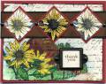
The difference is clear with My Acrylix stamps from Close to my Heart.
See for yourself and shop on-line at www.karensharon.myctmh.com
Independent Consultant with CTMH since April 2007
Registered: April 22, 2005 Location: Boca Raton, FL Posts: 14382
Thu, Mar 01, 2007 @ 6:03 AM
This is wonderful!! I love all of the elements you put into the background to make it so rich and interesting. Love the contrast of the bold black too. Very Well Done, Indeed!!!
I have this flower stamp but have never created anything as striking as this. Will case this for sure! TFS