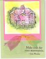
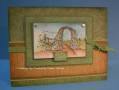
I stamped the cottage image with Staz-On black on the glossy cardstock (probably no good reason for this, I just think it gives a more intense black). I masked the awning and windows with a white crayon (yes the windows). Then I sponged cameo coral, certainly celery, and summer sun over the top. I wiped the crayon off and went back in with a q-tip and daubed summer sun ink onto the windows. I did it once without masking off the windows, and I preferred the glowing window effect better. Then I did a no-tie bow below the image on the pink cardstock. I stamped the garden arch with certainly celery and stamped the words with basic black to the right of the arch.
Date: Sunday, February 25, 2007 GMT Views: 470
Favorited:3
Registered: November 17, 2007 Location: On the coast with the most Posts: 129
Tue, Nov 27, 2007 @ 3:51 PM
I just received this stamp set today and I'm looking at all the wonderful cards produced using the cottage stamp and I gotta say, I LOVE the color combination you used! VERY creative and ORIGINAL! These colors work very well together and it's sort of an unexpected surprise. I love how the garden arch is subtle - it suddenly "appears" when you read the nearby quote.
The whole thing just WORKS! LOVE IT.
Laurie from RED SOX NATION, Massachusetts
------------------------------ ~L@urie from RED SOX NATION, Massachusetts
*TO LIVE A CREATIVE LIFE, WE MUST LOSE OUR FEAR OF BEING WRONG*