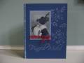
I like this card but it just seems to be missing something. What would you have done differently? I used brilliance silver pigment ink for the branches and verse....it looks white on the scan. Thanks for looking!
Date: Sunday, September 17, 2006 GMT Views: 334
Favorited:4
Additional Info
Stamps: Stampin' up, Paper Inspirations
Paper: Night of Navy, vellum
Ink: silver brilliance
Accessories: prismacolor pencils, glitter, red ribbon
Registered: January 31, 2005 Location: South Central Wisconsin Posts: 7598
Sun, Sep 17, 2006 @ 9:35 PM
I think it's beautiful just as it is, but if you feel there's too much blue space, maybe add a branch coming out of the top of the image, or a spray at the bottom, maybe ghosted behind the sentiment? Love that image by the way - it's a nice, vintage look!
------------------------------
When you follow the sheep, you end up in sheep dip.