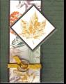
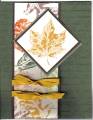
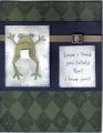
This was inspired by a card on pg 204 of the IB&C using a different set. The vertical sentiment is way out there for me and I'm trying to like it, I'm finding I keep sticking with the same boring color schemes despite owning a lot of cardstock. Maybe some sponging would have made this more interesting and livened it up?
Date: Tuesday, August 15, 2006 GMT Views: 1262
Favorited:14
Registered: March 5, 2004 Location: Orlando, Florida Posts: 332
Wed, Aug 16, 2006 @ 1:16 AM
This card is awesome just the way it is! I like it because it is clean and crisp and the vertical greeting is what caught my attention. Going into my favorites...
TFS
Registered: July 21, 2006 Location: New York Posts: 2525
Sun, Oct 28, 2007 @ 7:27 PM
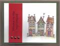
love the houses and the vertical statement. it reminds me of old victorians, which i am partial to...i live in one. this card is just great the way it is. tfs