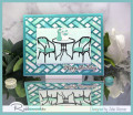
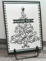
The hardest part to making this card was choosing the patterned paper! With the tree having such bold lines I needed something that would compliment the focal image, and a lot of my patterns were too dainty. I think the stripes coordinates with those bold lines. Also the picture makes it look black, but it is actually a deep evergreen. Thanks so much for taking a closer look! Check out my blog for more details and to see the inside of this card.
Registered: February 10, 2006 Location: Mid-Atlantic Posts: 13092
Sun, Oct 08, 2023 @ 2:47 PM
I think you made an excellent designer paper choice .... it perfectly compliments your beautiful tree.
------------------------------ Rita
God demonstrated His love toward us, in that, while we were yet sinners, Christ died for us ... being now justified by His blood, we shall be saved from wrath through Him. Romans 5:8 & 9
Registered: June 4, 2009 Location: Deatsville, Alabama Posts: 82271
Sun, Oct 08, 2023 @ 5:54 PM
This is so elegant, Terri. Great choice to stay B/W and great dsp. Wonderfully done. Hugz
------------------------------ Nancy Williams - Hope your day is Spirit-filled and ink-filled (in that order)!DRS Designs-DT, Punchkateerforever, Dirty Dozen Alumni
Terri, this is a great case of Raye Lynn's inspiration card. The scrolling Christmas tree is so lovely done with the dark green ink. Your designer paper is perfect to highlight the main image.