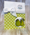
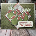
MY COASTAL CABANA BLING HARDLY SHOWS IN THE PICTURE BUT IRL IT'S THE HIGHLIGHT OF THE CARD!! DARN PICTURE!! DESSERT OPTION IS ANYTHING GOES SO I ADDED OLD OLIVE FOR MY LEAVES. FUN COLORS FOR ME - OUT OF MY WHEELHOUSE BUT I LOVE THEM! HOPE YOU DO TOO! HAPPY TUESDAY EVERYONE!
Date: Monday, October 2, 2023 GMT Views: 364
Favorited:0
Registered: February 19, 2011 Location: Fullerton, CA Posts: 15255
Mon, Oct 02, 2023 @ 7:44 PM
I don't know if it's the bling makes this card because all your other elements look pretty darn nifty to me. Love that diagonal gingham paper for the base and how beautifully it "peared" with that wonderful ef (sorry, I couldn't help but pun). The pears look delightfully delish as well. Fabulous card.
Splitcoast Dirty Dozen Splitcoast Challenge Hostess Proud Fan Club Member
Registered: September 24, 2007 Location: WA Posts: 13984
Mon, Oct 02, 2023 @ 8:11 PM
I love the way you colored the pair of pears, Karen. So realistic with the green highlighted with yellow. And yes, I do see those CC gems, and they're so pretty! Love the layout on this card!
------------------------------ Barbara Splitcoast Dirty Dozen My website: Inky Fun SCS Fan Club Member Color Challenge Team Member QFTD215
Registered: October 12, 2007 Location: Arizona Posts: 70555
Tue, Oct 03, 2023 @ 7:51 AM
Fabulous design. Love the happy gingham paired with the embossed panel. Your beautiful bow is always a wonderful feature. Lovely coloring on the pears. I can imagine IRL the pretty gems drawing the eye right up to the sentiment. Great card. Thanks for the wonderful colors this week!