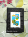
I've spent longer trying to photograph this than it took to make, and that's saying something because I had to wait for the blue to try before going in with the yellow. This is as good as it gets - it looks better in real life.
No particular artist, just modern art with some gears added for a steampunk vibe. I stamped the image on watercolour paper and embossed with gold. Coloured with Twinkling H2Os. Covered a small piece of paper with sticky tape and then burnished gilding flakes in, then cut the gears. Tried several backgrounds, in the end the plain black set it off best. A black base, then a trimmed-down layer embossed with Brickworks, and then the image panel (top and bottom ends distressed) popped up on foam.
Date: Friday, May 19, 2023 GMT Views: 217
Favorited:0
Splitcoast Dirty Dozen Splitcoast Challenge Host Proud Fan Club Member
Registered: April 11, 2016 Location: Posts: 30054
Sat, May 20, 2023 @ 2:29 AM
Love this art creation and texture. Happy weekend
------------------------------ The Difference Between Try and Triumph Is Just A Little Ump Wednesday: Alpha Challenge
Thursday: Ways To Use It Challenge
Monthly: MMJ Challenge….get inky and have fun
Registered: July 19, 2010 Location: Conway, MA Posts: 7513
Sat, May 20, 2023 @ 4:56 AM
The steam punk vibe is a great pairing to your geometric background! I'm also loving the embossed brick bg on black; it reminds me of an old mill/factory converted to an art gallery/ museum.
------------------------------ Julie Proud Fan Club Member, CC595 Favorite, CC March 2017 Guest Designer, SC Winter 2018/19 Guest Designer