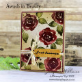
This is a very basic and quick card for me - not gonna lie- kinda proud of myself for making something basic and not a lot of LABOR. The picture makes the ribbon look like it's a bad match but in real life it's a great blend. I wanted to make a card that was entirely different from the first one I made with this color combo.
THIS IS THE WEEK WHERE WE ALL BROUGHT BACK ONE OF OUR FAVORITES FROM THE LAST 100 CHALLENGES AND IF YOU CHOOSE OUR COLORS AND WE PICK YOUR CARD AS OUR FAVORITE THEN YOU WIN A PRIZE!!! MY COLORS WERE PETAL PINK, FLIRTY FLAMINGO AND SOFT SEA FOAM - DESSERT WAS SCALLOPS - PICK MY COLORS! PICK MY COLORS! JUST KIDDING...... Happy Tuesday everyone!
Date: Monday, June 13, 2022 GMT Views: 1534
Favorited:5
Splitcoast Dirty Dozen Splitcoast Challenge Hostess Proud Fan Club Member
Registered: September 24, 2007 Location: WA Posts: 13911
Mon, Jun 13, 2022 @ 7:49 PM
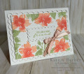
I love the shading on the flowers, Karen, and actually, the entire layout of the card. Your greetings are always so heartfelt--love this one! And all the scallops, too--great layout!
------------------------------ Barbara Splitcoast Dirty Dozen My website: Inky Fun SCS Fan Club Member Color Challenge Team Member QFTD215
Registered: October 12, 2007 Location: Arizona Posts: 70089
Tue, Jun 14, 2022 @ 7:10 PM
Beautifully done. I like how you stamped the flower around the edges. The colors look fabulous! Excellent inspiration to use this color combo. Thanks for everything you've done to help the Color Challenge reach 900!