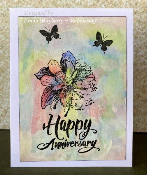
Not a good day for painting here 100 degrees this morning and 10% humidity. This is my second attempt and really watery colors gave me a fighting chance at some blends - plus the resulting pastels were more appealing to me than the dark glompy mess when I got when I tried more pigmented colors. ( I really debated whether to post that one, too, and decided maybe in the chat thread)
On this one I used Royal Purple, Cerrulean Blue, Red and Kelly Green to create and overall abstract background.
Date: Wednesday, June 8, 2022 GMT Views: 396
Favorited:3
Registered: October 19, 2007 Location: Packer Country, WI Posts: 72145
Wed, Jun 08, 2022 @ 12:08 PM
Glad you uploaded this card in the gallery. It really is lovely and shows how this technique can be difficult when very hot and dry. I like your blends with the more soft colors. The stamping images look great and really pops. Terrific card. Stay cool.
Registered: June 29, 2004 Location: Sugar Land. Texas Posts: 79843
Wed, Jun 08, 2022 @ 3:02 PM
Love this pretty background.
------------------------------ LizThe joy of the LORD is my strength.Right Brain Madness --My blogProud member of the redDivasKSS certified multi-step stamperFan Club member since 2004
Registered: July 9, 2008 Location: Stars Fell on Alabama Posts: 75034
Wed, Jun 08, 2022 @ 3:05 PM
I love your card and think it is beautiful. Glad you posted here. The pastels look great and the black flowers are so pretty against it. I know about the humidity. Horrible!
------------------------------ My Blog---My Gallery---My PinterestI'm a Punchkateer! (Prez) FOREVERDirty Dozen Alumni2014 CAS Spring DT--- Inspiration Challenge Co- Hostess 12/02/17-12/28/19 Watercolor Wednesday Design Team Hebrews 13:2Brenda