This is for today's challenge, which you can view here.
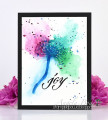
I ended up with too much of the darker colour in the centre of my flower, but it was late so I went with it.
I enjoyed the video very much, thank you Angela.
Date: Tuesday, February 22, 2022 GMT Views: 215
Favorited:3
Registered: May 25, 2006 Location: So. Oregon Posts: 122102
Tue, Feb 22, 2022 @ 7:34 PM
I am so impressed with how controlled your splatter is for each segment of color Kia. That is very cool. and I really like how you added "leaves" to the stem too
Registered: July 9, 2008 Location: Stars Fell on Alabama Posts: 75034
Tue, Feb 22, 2022 @ 7:49 PM
The flowing colors look great and it is such a pretty card. Pretty stem, too.
------------------------------ My Blog---My Gallery---My PinterestI'm a Punchkateer! (Prez) FOREVERDirty Dozen Alumni2014 CAS Spring DT--- Inspiration Challenge Co- Hostess 12/02/17-12/28/19 Watercolor Wednesday Design Team Hebrews 13:2Brenda
Registered: February 23, 2016 Location: El Paso, TX Posts: 23018
Wed, Feb 23, 2022 @ 9:16 AM
I agree with Anita - a few white streaks and dots radiating from the center will brighten this and take away that "too dark" feeling you're getting. Love your spatters - I still struggle with those (probably because I always forget to add them) so don't get enough practice. Love the illusionary leaf shapes near the stem - I threw in a few of those, too.
------------------------------ Linda aka Bubbles
I'm not a Hoarder . . . I'm the Curator of an extensive collection of embellishments!!
Proud Fan Club Member Guest Designer Color Challenge July 2017 Favorites Notification Team
You chose a beautiful color combo for your dandelion. Great splatters. I found it difficult to get the center to come out right, hence the 4 tries. LOL. You did a beautiful job!