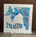
I was inspired by a lovely pink card in Marilyn's gallery (Hello, Butterfly! by marilynmac at Splitcoaststampers) but I strayed quite a bit in making this square version in blue. I am also entering my card for Jugs615 (http://justusgirlschallenge.blogspot...olor-week.html) but I think my alcohol ink blues are too bright. I used several blues and silver alcohol inks and silver card behind my alcohol ink sentiment. I love it even if it is too blue.
Date: Sunday, January 16, 2022 GMT Views: 637
Favorited:6
Splitcoast Dirty Dozen Creative Crew SU Design Team Alumni
Registered: May 18, 2004 Location: Southwest Michigan Posts: 36980
Sun, Jan 16, 2022 @ 1:12 PM
My first reaction upon seeing this was "what gorgeous colors!". So, not too blue for me : ) The partially cut panel with that gorgeous background behind it along with that pretty butterfly? Perfection!
------------------------------ Claudia Splitcoast Fan Club Member
Registered: June 29, 2004 Location: Sugar Land. Texas Posts: 79473
Sun, Jan 16, 2022 @ 2:16 PM
Love these blues and this beautiful designed card!
------------------------------ LizThe joy of the LORD is my strength.Right Brain Madness --My blogProud member of the redDivasKSS certified multi-step stamperFan Club member since 2004
Registered: February 19, 2011 Location: Fullerton, CA Posts: 14981
Sun, Jan 16, 2022 @ 2:55 PM
Gorgeous!!! And, it's definitely not too blue for me. I love your AI background. I've seen a few of your cards on the Clean and Simple Card Making FB page. You should add this one there too. It's a beauty.