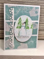
I had printed this image a while ago and it had a sort of blue gray background. I hadn't used it because I could not find anything I liked with that BG. So I decided to get rid of the BG. Changing the BG to a lighter blue did the trick. It worked perfectly for my card.
Date: Tuesday, November 2, 2021 GMT Views: 499
Favorited:2
Registered: June 29, 2004 Location: Sugar Land. Texas Posts: 79436
Wed, Nov 03, 2021 @ 1:23 AM
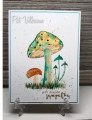
You did some great fussy cutting on this. I know we have all gone to diecutting so much, but it is always fun to see someone's scissor skills put to use. It truly is an art in itself. I love the basic patterns of your papers with this as not to distract from the beauty of the art of the image.
------------------------------ LizThe joy of the LORD is my strength.Right Brain Madness --My blogProud member of the redDivasKSS certified multi-step stamperFan Club member since 2004
Splitcoast Dirty Dozen Creative Crew SU Design Team Alumni
Registered: May 18, 2004 Location: Southwest Michigan Posts: 36959
Wed, Nov 03, 2021 @ 6:28 AM
This image is SO pretty ~ it has a vintage feel to me. Great job pulling the colors from the image and highlighting them in your paper panels. This is a great sketch for using designer papers!
------------------------------ Claudia Splitcoast Fan Club Member