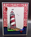
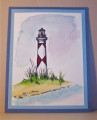
This was jump started by this tea towel seen here inside the Anne of Green Gables site.
I wanted to keep it CAS and showcase that texture and I did end up having to cut the image down as the sentiment did not stamp perfectly and when I touched that up with a black pen evidently the paint was not quite as dry as I thought it was and I drug black marks around the image and had to cut all that off. So, I ended up going around the outer frame with more black paint to cover up the partial sentiment, siggy line & half a seagull ( oops) this is up on foam tape. Thanks for this challenge Kia & tfl.
Date: Friday, October 8, 2021 GMT Views: 619
Favorited:3
Registered: August 30, 2006 Location: Saugus, Massachusetts Posts: 65056
Sat, Oct 09, 2021 @ 9:05 AM
I'm laughing over all the things that went wrong as you created this Stacy - I think we've all been there!! but I love how cut down this image is with the top of the light house above the frame - you ended up with a beautiful inspired design!
------------------------------ Julia Aston Proud member of SCS Fan Club and Dirty Dozen Alumni, former DT member on Color Challenge My Blog
Registered: January 28, 2007 Location: Northeast GA, USA Posts: 963
Sat, Oct 09, 2021 @ 10:44 AM
But hey! It turned out beautiful!!! Different than you had planned, but still just striking. I think the thick black frame really adds to it. Sometimes those “mistakes” give rise to new creativity.


 this is up on foam tape. Thanks for