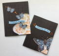
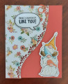
I loved this weeks technique challenge and wanted to see if I could use my butterfly die for the corner. Not so much. The butterfly stamp covers too much of the corner so you really can't see what's behind it. So, I thought I would try one of the decorative frames I have and smaller butterflies. I like this much better, but I was so focused on where I put my banner top to bottom, I didn't notice I was covering the "decorative" point of the frame so it kind of just looks like a lump now. LOL. So, it's an experiment I won't be repeating.
I also wanted to use the week's colors. I had stamped the flowers on a white panel and since there are more flowers than what shows through the cut out, I decided to add an acetate panel behind the cut out for stability and glue the panel to the inside of the card so the recipient can see ALL the flowers.
I did clear heat emboss a plaid pattern on the front of both cards just for some texture and added interest. I colored the sentiment strip with the same Copic I used for the butterflies before I die cut the banner. I thought it needed a touch of the curry or orange on the front and I found some old rhinestones in my stash. I only had three orange left when I did the second card or it would probably have more.
Well, I don't think this was a total miss, but it certainly isn't a big hit either. But, I thought I would post them so you all could learn from my mishaps. I still had fun trying to figure out how to do this and I'm glad I tried. If I have time, I will go back and try to do the technique the way it's actually shown in the video. Sometimes it good to reinvent the wheel, but sometimes you should roll with it as is. LOL. Enjoy your day, everyone, and TFL.
Date: Thursday, September 9, 2021 GMT Views: 817
Favorited:6
Registered: November 7, 2009 Location: Sacramento Posts: 39039
Thu, Sep 09, 2021 @ 6:50 PM
I think both are lovely cards! I like the tone on tone stamping on the card panel and I think the one with the big butterfly works just fabulously, actually, both are fabulous. I think we tend to be hardest on ourselves!
Registered: October 23, 2011 Location: Western, NY Posts: 7484
Thu, Sep 09, 2021 @ 9:35 PM
Both beautiful! These are so unique... Love, love love the way these came out. The black texture paper, the color combos, and the wave banner headlines are perfect! Just pinned these...
Betty
Splitcoast Dirty Dozen Alumni SCS Gallery Moderator Splitcoast Challenge Hostess Teapot Tuesday TEAm
Registered: July 27, 2007 Location: Dublin, Ireland Posts: 131741
Fri, Sep 10, 2021 @ 10:03 AM
Personally I would consider them both a success in their own right, even if you feel they're a fail at the technique. I think the butterfly one is fabulous, but I like seeing more of the background florals in the frame shape. And the embossed plaid is a spectacular look.
Registered: January 20, 2010 Location: Brampton, Ontario Posts: 26128
Fri, Sep 10, 2021 @ 1:36 PM
These are two lovely cards regardless of what you think of as 'fails' for the technique! Thank you for posting them! ...now I am going to check out that technique, ha, ha!
Registered: October 19, 2007 Location: Packer Country, WI Posts: 72017
Fri, Sep 10, 2021 @ 3:40 PM
They are beautiful with the corner cutout technique. Thanks for your detailed deets on how you did this. I have to go check it out. Thanks for the inspiration.
Registered: August 15, 2007 Location: Twin Cities MN Posts: 50583
Sat, Sep 11, 2021 @ 4:58 PM
I think they’re both fabulous although the large butterfly one is my fav. You really took this technique and ran with it making your own mark..I live the different shapes instead of the typical circle…love ‘em!