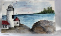
Well I did ok keeping the sky loose but then as I went down the card I got caught up in the details. But still I am pretty happy with this. It is from a picture I had taken of Portland Head Light many years ago. My little fence needs to be bigger, but not changing it now.
Date: Wednesday, August 25, 2021 GMT Views: 595
Favorited:5
Registered: February 5, 2007 Location: St. Louis, MO Posts: 92650
Thu, Aug 26, 2021 @ 4:03 AM
Great painting for the challenge, Pat. The sky is fabulous as is your design. Like how you left white for the crashing sea onto the land and the lighthouse and attached building have dimension and perspective. Not all watercolor has to be "loose". Your more detailed lighthouse makes it the focal point for sure. Well done!
Registered: October 19, 2007 Location: Packer Country, WI Posts: 72145
Thu, Aug 26, 2021 @ 4:20 AM
Amazing job on this original painting. Using a reference picture really helps when sketching. Right. Sure glad you came and played in the challenge and gave us this wonderful painting for the gallery.
Registered: February 23, 2016 Location: El Paso, TX Posts: 23018
Thu, Aug 26, 2021 @ 6:55 AM
This is just awesome! And I don't think your fence is too small - it is only an insignificant detail that enhances the commanding proportions (and importance) of the lighthouse.
------------------------------ Linda aka Bubbles
I'm not a Hoarder . . . I'm the Curator of an extensive collection of embellishments!!
Proud Fan Club Member Guest Designer Color Challenge July 2017 Favorites Notification Team