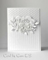
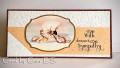
Thank you to Pat/pvilbaum for the sketch this week...I have the sad task of making a sympathy card and no layout seemed to work for this image (it was already cut and matted), until I saw Pat's sketch. Since this was a slimline card, I stretched the sketch a bit.The peach cs had brown watercolor flicked with a brush on it for added visual texture (added pearls, but didn't work, so took them off). The sentiment was printed using Albemarle Swash and BernhardFasD fonts.
Thanks for the challenge, Pat, and thanks for looking!
Date: Wednesday, June 16, 2021 GMT Views: 846
Favorited:2
Registered: February 19, 2011 Location: Fullerton, CA Posts: 14991
Wed, Jun 16, 2021 @ 3:13 PM
Beautiful card for a sad occasion but I think it is lovely and peaceful and a beautiful design for a sympathy card. Thanks for listing your fonts. I love fonts almost as much as cards. Hugs.
What a beautiful sympathy card -- your image is such a lovely centerpiece. And you laid out the sentiment with the two different fonts brilliantly -- it looks authentically early 20th century.
Registered: November 24, 2013 Location: NYC Posts: 17688
Thu, Jun 17, 2021 @ 4:53 AM
This is so pretty. I really like the speckled strip bc it looks like sand. And that you flipped the embossed panel to be in the deboss position so it is more quiet-great for a sympathy card.
Really attractive font choices!
Excellent sympathy card. Peaceful.
------------------------------ Margot
I am a proud fan club member