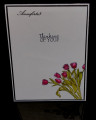
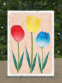
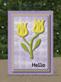
Design influenced by Splitcoaststampers WCW052 | untitled | Digital Project | This watercolor floral scene shows three colorful tulips and swirly BG on white watercolor paper. | Created via #Inkscape | Poster: brentsCards
Splitcoaststampers Watercolor Wednesday WCW052 | 5/26/2021 How to Paint Watercolor Flowers
How To Paint Watercolour Flowers Step By Step Includes Useful Tips
Video:
=================================================
Inkscape Colors, Objects, and Filters (textures, and finishes) are, as follows . . .
Special: white watercolor paper, brushes, felt tips
=================================================
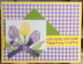
Bottom: Basic White plain 5 x 7 with thin Basic Black border
Petal Pink Layer | (from bottom):
1. Base: Petal Pink with Filter (Thick Paint, Evanescent)
2. Swirl: Petal Pink with Opacity (18%) and Filter (Tiger Fur, Cracked Glass)
3. White Floral Mask: Basic White with Filter (Film Grain, Evanescent)
Floral Sketches | (from bottom):
1. Floral: Basic Black with Filter (Canvas Bumps Alpha)
2. Stem: Basic Black with Filter (Canvas Bumps Alpha)
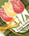
Red Tulip | (from bottom):
1. Back Gradient Base: Colors (Flirty Flamingo to Poppy Parade) plain
2. Back Gradient Texture: Poppy Parade with Opacity (42%) and Filter (Eroded Metal)
3. Middle Base: Cherry Cobbler plain
4. Front Base (two): Colors (Flirty Flamingo to Poppy Parade) plain
5. Front Texture (two): Colors (Flirty Flamingo to Real Red) with Opacity (42%) and Filter (Eroded Metal)
Yellow Tulip | (from bottom):
1. Back Base: Daffodil Delight plain
2. Back Texture: Daffodil Delight with Opacity (42%) and Filter (Eroded Metal)
3. Middle Gradient Base: Colors (Daffodil Delight to Bumblebee) plain
4, Middle Gradient Texture: Colors (same as 3) with Opacity (42%) and Filter (Cracked Glass, Eroded Metal)
5. Front Gradient Base (two): Colors (Pineapple Punch to Bumblebee) plain
6. Front Gradient Texture (two): Colors (same as 5) with Opacity (42%) and Filter (Eroded Metal)
Blue Tulip | (from bottom):
1. Back Base: Blueberry Bushel plain
2. Back Texture: Blueberry Bushel with Opacity (42%) and Filter (Eroded Metal)
3. Front Gradient Base (two): Colors (Seaside Spray to Pacific Point) plain
4. Front Gradient Texture (two): Colors (Purple Posy to Pacific Point) with Opacity (42%) and Filter (Eroded Metal)
Greeting Text Stamp | (as follows):
1. Text Base: Basic Black plain
2 Texture: Basic Black with Opacity (28%) and Filter (Cracked Lava)
WC Texture | (as follows):
1. Swirly: Smoky Slate with thin Basic Black border, Opacity (4%) and Filter (Growing Cell, Cracked Lava)
2. Rolling: Basic White with thin Basic Black border, Opacity (6%) and Filter (Paper Bump)
[shadow]: Filter (Drop Shadow) na
Date: Thursday, May 27, 2021 GMT Views: 407
Favorited:3
Registered: October 19, 2007 Location: Packer Country, WI Posts: 72142
Thu, May 27, 2021 @ 4:45 PM
Your tulips are beautiful in the vibrant colors!!! Lovely card and well done with the shading. Like seeing your cards each week. Glad you join the challenge.
Registered: July 9, 2008 Location: Stars Fell on Alabama Posts: 75038
Thu, May 27, 2021 @ 6:10 PM
Your tulips are shaped beautifully, Brent, and I like those colors. Looks like they are growing perfectly out of the ground. Thanks for joining us this week.
------------------------------ My Blog---My Gallery---My PinterestI'm a Punchkateer! (Prez) FOREVERDirty Dozen Alumni2014 CAS Spring DT--- Inspiration Challenge Co- Hostess 12/02/17-12/28/19 Watercolor Wednesday Design Team Hebrews 13:2Brenda
Splitcoast Dirty Dozen Splitcoast Challenge Hostess Teapot Tuesday TEAm
Registered: June 3, 2016 Location: France Posts: 60449
Fri, May 28, 2021 @ 2:15 AM
I love your tulips Bret, especially the blue one, I saw some very pretty species during my visit to Keukenhof, The Dutch Floral Park, yours could have been there!!