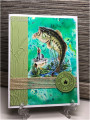
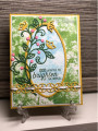
I ended up doing two, just because. I think I like the left one better than the right. The paper on the right was cheaper paper and it was much more absorbent. Need to buy more good paper. Fun challenge and good practice.
Date: Friday, April 30, 2021 GMT Views: 1012
Favorited:2
Registered: July 9, 2008 Location: Stars Fell on Alabama Posts: 74593
Fri, Apr 30, 2021 @ 9:12 AM
Super card, Pat, and I like the different colors in the water. Wonderful additions you added, also. I like your sentiments and had a smile over the blood pressure one. Beautiful work. Thanks for joining us this week.
------------------------------ My Blog---My Gallery---My PinterestI'm a Punchkateer! (Prez) FOREVERDirty Dozen Alumni2014 CAS Spring DT--- Inspiration Challenge Co- Hostess 12/02/17-12/28/19 Watercolor Wednesday Design Team Hebrews 13:2Brenda
Registered: December 25, 2005 Location: Drinking in God's Good Grace...! Posts: 42118
Fri, Apr 30, 2021 @ 9:57 AM
All I can say is WoW! Beautiful cards!! TFS!!
------------------------------ "God designed the human machine to run on Himself. HE Himself is the fuel our spirits were designed to burn..." C.S. Lewis, Mere Christianity
Registered: October 19, 2007 Location: Packer Country, WI Posts: 71852
Fri, Apr 30, 2021 @ 7:02 PM
Both are beautiful with the striking skies and waters . Thanks for showing us the comparison of paper. I found it interesting how the foliage distinguishes were they might be located. Thanks for sharing these super cards.