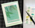
So, I am totally in when someone says lets go to the ocean. ( always )
the one that is dried on the right I did late last night and I was not real thrilled with the color I mixed for the water and I think the shoreline was too curvy so, I tried it again real quick today after work and I was able to use a paper towel to dry the brush off more and I got better looking waves and clouds I think with a dry-er brush. Thanks for this challenge Brenda, & tfl.
Date: Thursday, April 29, 2021 GMT Views: 369
Favorited:2
Registered: July 9, 2008 Location: Stars Fell on Alabama Posts: 74629
Thu, Apr 29, 2021 @ 5:52 PM
I love both but, like you, I love the color of the water on the left one. It is a color I wish I had used. Your watercoloring is excellent on both and I like the beaches as well as all the rest. Good work. Thanks for joining us and hope to see you next week.
------------------------------ My Blog---My Gallery---My PinterestI'm a Punchkateer! (Prez) FOREVERDirty Dozen Alumni2014 CAS Spring DT--- Inspiration Challenge Co- Hostess 12/02/17-12/28/19 Watercolor Wednesday Design Team Hebrews 13:2Brenda
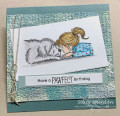
Both paintings look beautiful! I love the color of the water in the second one! You did an amazing job of featuring the bright light reflection on the ocean water! Fabulous cards!
Registered: October 19, 2007 Location: Packer Country, WI Posts: 71899
Thu, Apr 29, 2021 @ 8:16 PM
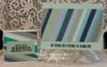
Two beautiful cards, Stacy. Really like the reflection you created with the white space. Isn't it fun creating colors with the mixtures. Thanks for showing us the comparison with less water. Your grasses are fantastic with their wispy look. The added props also shows us what you use for your tools. Those are my favorite brushes. You sure are a natural with this medium. Thanks for joining us this week.
Registered: March 8, 2005 Location: Halfway between Dallas and Houston Posts: 23968
Fri, Apr 30, 2021 @ 10:06 AM
These are great Stacy! I am never happy with my first painting but have usually, not yesterday, learned to just go with it because it sometimes gets worse not better. But I do love your water color in the second painting. The other parts of the first are just great though.
------------------------------ Proud Fan Club Member
Dirty Dozen Alumni
"Art washes away from the soul the dust of everyday life."
Registered: February 23, 2016 Location: El Paso, TX Posts: 22778
Sun, May 02, 2021 @ 12:26 PM
Good job on both and you got beautiful whitecaps in both versions - though like you, I do tend to like the gentler edge on the beach in the painting on the left.
------------------------------ Linda aka Bubbles
I'm not a Hoarder . . . I'm the Curator of an extensive collection of embellishments!!
Proud Fan Club Member Guest Designer Color Challenge July 2017 Favorites Notification Team