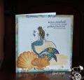
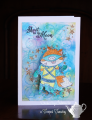
The first time I tried this I thought my colours were too close. I overcompensated this time so I guess I'll have to try one more time soon. However, I created a background I was happy to use with this floral stamp which was in my "want to use" pile. Coloured with Polychromos and sponged with Antique Linen. I found it took several mists of the top (bottom, green section) to lift enough colour to really show.
Date: Sunday, April 11, 2021 GMT Views: 918
Favorited:2
Splitcoast Dirty Dozen Splitcoast Challenge Host Proud Fan Club Member
Registered: April 11, 2016 Location: Posts: 30056
Sun, Apr 11, 2021 @ 10:46 PM
So pretty Sabrina. TFS. Happy day
------------------------------ The Difference Between Try and Triumph Is Just A Little Ump Wednesday: Alpha Challenge
Thursday: Ways To Use It Challenge
Monthly: MMJ Challenge….get inky and have fun
Registered: January 20, 2010 Location: Brampton, Ontario Posts: 26117
Mon, Apr 12, 2021 @ 5:36 AM
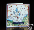
Love your green and blue background - definitely the colours I tend to chose. The stencil works really well with that lacy die cut. What a beautiful card this is!
Registered: February 27, 2007 Location: LaCrosse, Wisconsin Posts: 39104
Mon, Apr 12, 2021 @ 6:50 AM
Yes, agreed on the several mists, although as it dries, it also has more contrast. So pretty, I think it turned out beautifully and what a lovely image in the center.
------------------------------ Jean Bean the Dancing Queen "You can play a shoestring if you're sincere." -John Coltrane