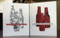
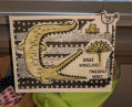
If you saw my previous "Cheers" cards, I wrote that I really wanted the bottles to be white but the computer generated sentiment looked too flat. Then I had the idea to clear emboss the sentiment which helped immensely. Still not as good as ink would have been, but acceptable. I also tried to use Glossy Accents but the ink reacted and the white lost its clarity.
The process is the same: Stamped and embossed the label. Cut with the bottle die only this time I did all three bottles the same size. I wish the bottles were a bit bigger, but then next time I will wish they were a bit smaller. Because I'm Goldilocks and I want it all to be "just right". Dry embossed the woodgrain bg and glued everything down. The sentiment is typed in Arial font.
I photographed the new card with the previous one so you could see them side-by-side. I prefer white wine when I drink and apparently I prefer it on my cards as well. What's your favorite flavor -- white or red?
Thanks for stopping by. I hope you are having a Goldlilocs day and that everything is "just right".
Date: Friday, April 9, 2021 GMT Views: 316
Favorited:2
Registered: February 23, 2016 Location: El Paso, TX Posts: 22892
Sat, Apr 10, 2021 @ 10:54 AM
These turned out great, Debbie, and you have used this stamp in a totally different way tha I would ever have considered. I'm a white wine kinda gal, too, so yep - that's my fav!
------------------------------ Linda aka Bubbles
I'm not a Hoarder . . . I'm the Curator of an extensive collection of embellishments!!
Proud Fan Club Member Guest Designer Color Challenge July 2017 Favorites Notification Team
Splitcoast Dirty Dozen Alumni SCS Gallery Moderator Splitcoast Challenge Hostess Teapot Tuesday TEAm
Registered: July 27, 2007 Location: Dublin, Ireland Posts: 131726
Sat, Apr 10, 2021 @ 11:56 AM
Cutting the bottles from the stamped background looks super. I like both versions, a marginal preference for the white. I liked that stamp when I saw Linda use it. I was saying to her that Gewürztraminer was the "house wine" when I worked for a retired admiral and his wife. Mostly for drinking I prefer red, but a nice white is very nice.
Registered: June 4, 2009 Location: Deatsville, Alabama Posts: 83044
Sat, Apr 10, 2021 @ 6:57 PM
Both are well done! Both have a great look and feel (I like the texture more of course). I like the bottle die. Love your Goldilocks comment! Hugz
------------------------------ Nancy Williams - Hope your day is Spirit-filled and ink-filled (in that order)!DRS Designs-DT, Punchkateerforever, Dirty Dozen Alumni
Registered: January 20, 2010 Location: Brampton, Ontario Posts: 26128
Sun, Apr 11, 2021 @ 8:31 AM
What a super pair of cards! I had that background stamp in my cart and then took it out - looks like it is going back in! I would be hard put to pick a favourite card here though I do favour the reds for drinking. As long as its dry I will drink any colour of wine though. :-)