Registered: December 31, 2007 Location: Minneapolis MN Posts: 2572
Thu, Apr 08, 2021 @ 8:52 AM
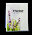
You really achieved gorgeous, rich tones in your stunning lavender field. I really like the salted effects too which add such lovely texture. Well done!!
Registered: July 9, 2008 Location: Stars Fell on Alabama Posts: 74740
Thu, Apr 08, 2021 @ 9:24 AM
It's awesome, Polly. I love the different colors you used for the lavender and all the greenery beneath. Why did I forget the sea salt? That is the second time I have done that. Thanks for bringing your beautiful work to us this week.
------------------------------ My Blog---My Gallery---My PinterestI'm a Punchkateer! (Prez) FOREVERDirty Dozen Alumni2014 CAS Spring DT--- Inspiration Challenge Co- Hostess 12/02/17-12/28/19 Watercolor Wednesday Design Team Hebrews 13:2Brenda
Jeremiah 29:11 Splitcoast Dirty Dozen Alumni | Proud FanClub member since 2017
My Gallery | My Blog "The wind of Heaven is that which blows between a horse's ears."
Registered: November 7, 2006 Location: Willamette Valley Oregon Posts: 34503
Fri, Apr 09, 2021 @ 12:34 PM
Lovely impressionist style, Pol. I especially like the hue (range) of the colors! And of course the salted bg.
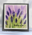
5.5 by makes a great size card, doesn’t it?
------------------------------ Susan~~~One4Joydaily I'm a FAN CLUB member, U? MY GALLERYof visual Delights MY BLOG