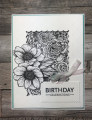
Another variation of the card next to this one in the gallery. This time I reached for a beautiful coral color to contrast the black and white designs in the dsp. I also like to see a nice coral against black and white for a nie contrast. The layout is one I have used in the past, a little different way to use up dsp.
Thanks for looking.
Date: Friday, April 2, 2021 GMT Views: 264
Favorited:2