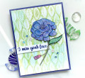
I think my mountain ridges look more like waves than mountains ... I followed the video pretty much, using Daniel Smith and Schmincke water colour. Fun and relaxing. You can find the video we used . I have more pics on my blog in this post.
Thank you for looking.
Date: Tuesday, February 16, 2021 GMT Views: 363
Favorited:5
Registered: July 9, 2008 Location: Stars Fell on Alabama Posts: 74640
Tue, Feb 16, 2021 @ 7:58 PM
I love your strong colors, Kia, and the sky is beautiful with just a bit of yellow at the bottom. And, I really like that sentiment, too. Super watercolor.
------------------------------ My Blog---My Gallery---My PinterestI'm a Punchkateer! (Prez) FOREVERDirty Dozen Alumni2014 CAS Spring DT--- Inspiration Challenge Co- Hostess 12/02/17-12/28/19 Watercolor Wednesday Design Team Hebrews 13:2Brenda
Registered: March 20, 2008 Location: Hamilton, Ontario Canada Posts: 615
Wed, Feb 17, 2021 @ 4:51 AM
Kia, your colors, especially in your sky are SO beautiful, your sky looks so realistic with how you have so expertly blended your colors, but then, all of your colors are used in a very expert manner, I am impressed as usual! I really like how you have placed your sentiment in black on the sky, it's so very effective. I first thought that you had hand-written this sentiment, but I'm guessing because you have listed a stamp that it may be the sentiment. No matter what, this is truly beautiful!!! I am impressed!!! Your coloring, from your blending to your using color to highlight and delineate is wonderful!!! I am always so pleased to see your work here--I'm not on the gallery nearly enough, it's a treat to see your work.
Best wishes, I hope that you and your loved ones continue to stay safe and healthy,
Jeremiah 29:11 Splitcoast Dirty Dozen Alumni | Proud FanClub member since 2017
My Gallery | My Blog "The wind of Heaven is that which blows between a horse's ears."
Registered: February 23, 2016 Location: El Paso, TX Posts: 22778
Wed, Feb 17, 2021 @ 12:16 PM
Love both your intense colors and the sun-kissed glow on the farthest range of mountains. Beautiful job of increasing the pigmentation and intensity with each layer coming forward. I know from your painting (and several others today) that I tend to add TOO much water to my pigment when I start. You'd think after 9 months, I'd remember these dry lighter than they look wet . . . .
------------------------------ Linda aka Bubbles
I'm not a Hoarder . . . I'm the Curator of an extensive collection of embellishments!!
Proud Fan Club Member Guest Designer Color Challenge July 2017 Favorites Notification Team