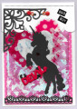
Let's call him "Brad", shall we? There are two loopy brads at the top of the page and are hardly a focal point and easily missed, but they were necessary to fill the two holes in this printable invitation paper. I altered their color with a Copic marker. I just layered all the elements and went with this studly stallion theme. Yes, this was fun to make.
Date: Thursday, February 4, 2021 GMT Views: 391
Favorited:2
Splitcoast Dirty Dozen Splitcoast Challenge Host Proud Fan Club Member
Registered: April 11, 2016 Location: Posts: 30054
Thu, Feb 04, 2021 @ 7:56 PM
Yep I like Brad. Cool card Lori. TFS. Happy day
------------------------------ The Difference Between Try and Triumph Is Just A Little Ump Wednesday: Alpha Challenge
Thursday: Ways To Use It Challenge
Monthly: MMJ Challenge….get inky and have fun
Registered: February 19, 2011 Location: Fullerton, CA Posts: 15112
Fri, Feb 05, 2021 @ 11:06 AM
And Brad is studly, indeed. Great card. Love all the prints and die cuts and embellishments you used. If I did that it would look like a mess on a piece of cardstock, but this looks fabulous. Fun idea for a Valentine's card.