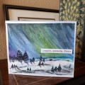
I really enjoyed this, except for painting the bottom part. That was hard for me and I thought I'd done a pretty poor job. But when I started adding the trees, it made more sense and now I like it quite well. I need to work on getting a brighter green....maybe yellow added to my green?? I also added a little graphite for shading and a bit of WOS for shine. I left out the snow because (correct me if I'm wrong), I don't think you'd see the northern lights if it was snowing. Wouldn't it be cloudy???? I used some white ink for snow on the trees. I so would love to see them in person.
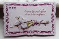
This is also for F4A571-a sympathy card. I tend not to make sympathy cards as such, I prefer to send a pretty, calm, serene card with a handwritten message. 'With Sympathy' is ok but most store bought cards are too gushy, sorry for your loss, how wonderful the person was, that kind of thing. I don't consider death a loss if you hold on to the memories. The price of love, as they say.
Date: Friday, January 29, 2021 GMT Views: 704
Favorited:4
Registered: March 30, 2008 Location: Somewhere between the Shire & Mordor! Posts: 4642
Fri, Jan 29, 2021 @ 8:48 AM
This is SO PRETTY, Anita! I HAVE NO IDEA about the snow & the Northern Lights! LOL BUT, your painting looks GREAT, either way! YEP, yellow would have brightened up your green! ;) I ALWAYS THOUGHT the cards in the store are too mushy for ANY OCCASION! LOL Even with picking my own sentiments now, I have a hard time finding the right ones that work for me! I just want a little something for the inside.... I've been tempted to write my own, but I don't like having to space the letters, etc.... I'd end up with eraser & pencil marks! LOL ANYWAY, a SUPER JOB, Anita!!! ;)<3
Registered: February 19, 2011 Location: Fullerton, CA Posts: 15112
Fri, Jan 29, 2021 @ 9:38 AM
I like the way you think Jean. I don't think death severs our ties to our loved ones either. I do recognize that losing the physical presence of your loved one leaves a hole and that grieving that loss is natural. But I always cling to the idea that they are in a place of pure love and happiness and they are laughing at me for my foolishnesses (which are many).
Your scene is perfect for the sentiment you chose. It is very serene and peaceful. I like the shades of blue and greens exactly because of your sentiment. The added white pen for the snow is a great touch.
Splitcoast Dirty Dozen Splitcoast Challenge Hostess Proud Fan Club Member
Registered: January 27, 2010 Location: Southern Ontario, Canada Posts: 51973
Fri, Jan 29, 2021 @ 10:21 AM
A wonderful scene of Northern Lights you have created Jean. Yes, I have read that when it is snowing it can make it difficult to see the lights, one would hope for very cold clear nights.
Our Northwest Territories are one of the best places to see the lights - here is an excerpt about the area. "The Northwest Territories is the world's Northern Lights mecca. Here, the Aurora dance an average of 200 nights per year. Why are the Northern Lights so frequent in the NWT? Because Canada's subarctic is blessed with crystal-clear nights, ultra-low humidity, and a perfect location directly beneath the Earth's band of maximal Auroral activity – the "Auroral oval.""
Registered: July 9, 2008 Location: Stars Fell on Alabama Posts: 74834
Fri, Jan 29, 2021 @ 10:36 AM
Very pretty sympathy card and I love the way you shadowed the trees. I like your Northern Lights and I geuss you are right about the snow. I added stars to my sky instead of snow. and I am thinking my snow had been on the ground just about all winter....lights or no lights.
------------------------------ My Blog---My Gallery---My PinterestI'm a Punchkateer! (Prez) FOREVERDirty Dozen Alumni2014 CAS Spring DT--- Inspiration Challenge Co- Hostess 12/02/17-12/28/19 Watercolor Wednesday Design Team Hebrews 13:2Brenda
This is gorgeous! I really like this for a sympathy card! My favorite sympathy cards are more soothing than somber! Your sky is beautiful! I like your shadows on the snow!