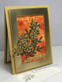
I tried the Coffee Filter Prints technique this time using the SU Pigment Sprinkles instead of the Brusho. The colors were so vibrant that I nearly threw the piece away. Then I started thinking, there are no mistakes only new opportunities so I put the piece to work on this card. It seemed to me that the gold foil blended well with the bright colors after having tried different colors of card stock. The shiny quality of the glossy photo paper seemed to call for something with equal shine. So here it is and Iâm pleased with the result.
This will go to my college freshman granddaughter whom has taken on an extremely difficult major and gets a bit discouraged at times. No fear, she is still at an A average. I just donât want her to give up. The inside reads, You are outstanding!
Date: Thursday, January 28, 2021 GMT Views: 750
Favorited:3
Splitcoast Dirty Dozen Alumni SCS Gallery Moderator Splitcoast Challenge Hostess Teapot Tuesday TEAm
Registered: July 27, 2007 Location: Dublin, Ireland Posts: 132007
Thu, Jan 28, 2021 @ 11:52 PM
I think the simple flowers look lovely over the rich background. I wish photos could better capture glossy photo card, but knowing what it looks like, I bet the gold foil is a great match.
I hope you kept the filters to use too!