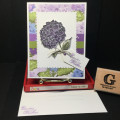
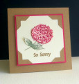
This was my second try - you would think that I would get better, but it just didn't work that way. I think the contrast between light and dark is maybe better in this one, but I actually like the first one better.
Date: Wednesday, January 13, 2021 GMT Views: 1304
Favorited:2
Registered: July 9, 2008 Location: Stars Fell on Alabama Posts: 74563
Wed, Jan 13, 2021 @ 6:23 PM
Both your cards are beautiful, Pat. Your leaves and stems look great, also.
------------------------------ My Blog---My Gallery---My PinterestI'm a Punchkateer! (Prez) FOREVERDirty Dozen Alumni2014 CAS Spring DT--- Inspiration Challenge Co- Hostess 12/02/17-12/28/19 Watercolor Wednesday Design Team Hebrews 13:2Brenda
Registered: March 20, 2008 Location: Hamilton, Ontario Canada Posts: 615
Wed, Jan 13, 2021 @ 8:09 PM
I personally am impressed with BOTH cards, but I know that I am more critical of my own work than anyone else, that's just how it works... I am not sure if you used a stamp or you created these flowers free-hand, but whatever you did, I think that you have created beautiful flowers, they look like poppies perhaps to me. Beautiful shading and blending of colors in your blossoms, and your leaves and stems are well done. Certainly so much better than I could create with watercolors. Your background really makes your blossoms pop.
Registered: January 11, 2017 Location: Wisconsin summer and Arizona winter Posts: 19733
Thu, Jan 14, 2021 @ 8:26 AM
Wonderful watercolored flowers! I love red, so this is my favorite. It's funny how we are so critical of our own work, yet others love it. I'm so glad you posted both cards, Pat!
------------------------------ Judy aka Gracie "Be a rainbow in someone else's cloud." Maya Angelou