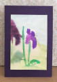
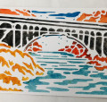
This is for WCW stamping with watercolor - I thought this would be a quick and easy but I really struggled with it . . . probably due more to the fact that I prefer stark realism rather than this very watery look . . . I ended up with ALOT of tries in the garbage today then pulled out this one (my first attempt) as it was less offensive to me than the others - LOL
Watercoloring the bg was easy enough but Can you believe that the image on the left is the SAME stamp as the image on the right?? obviously WAY too much water on the first stamping. This panel actually started out as a 4 1/4 x 5 1/2 - for me it became usable as a 3 x 4 1/2 with some of the bigger blobs cut away.
Date: Wednesday, September 2, 2020 GMT Views: 332
Favorited:2
Registered: July 9, 2008 Location: Stars Fell on Alabama Posts: 74752
Wed, Sep 02, 2020 @ 8:46 AM
Less offensive? You are so funny. I do see the difference and now if you don't like the watery look you will know to use less water. It is a learning experience with watercolor. I think it turned out very pretty. So happy you played along and stayed with it.
------------------------------ My Blog---My Gallery---My PinterestI'm a Punchkateer! (Prez) FOREVERDirty Dozen Alumni2014 CAS Spring DT--- Inspiration Challenge Co- Hostess 12/02/17-12/28/19 Watercolor Wednesday Design Team Hebrews 13:2Brenda
Registered: August 30, 2006 Location: Saugus, Massachusetts Posts: 65087
Wed, Sep 02, 2020 @ 9:28 AM
It probably does take practice to get the right ratio of water to ink - but this is beautiful in it's watery loveliness! You're iris are so pretty with your deep colors! I know I need to practice this some more too!
------------------------------ Julia Aston Proud member of SCS Fan Club and Dirty Dozen Alumni, former DT member on Color Challenge My Blog
I can believe it! I showed my guys today my late night attempts! It's hard to even believe the same artist did the first 5 tries. I really thought it would be easy too so I left it to last minute! There is a lot that goes into this. How much water, what kind of stamp and the paper! In the end I love how mine turned out and I feel like I learned so much. I can't wait to try it again. I love how yours turned out! The color combo is gorgeous and I love the flow of the paint! Beautiful!
Splitcoast Dirty Dozen Splitcoast Challenge Hostess Proud Fan Club Member
Registered: January 27, 2010 Location: Southern Ontario, Canada Posts: 51736
Wed, Sep 02, 2020 @ 6:58 PM
You have a lot of movement here Linda and I for one love that. It takes some practice yes, but suddenly in clicks and you have it. I would say you are off to a great start.
Splitcoast Dirty Dozen Alumni Creative Crew SU Design Team Alumni Demo Challenge Leader Splitcoast Challenge Host
Registered: February 8, 2004 Location: South of Oklahoma, North of DFW Airport = North Texas! Posts: 44395
Wed, Sep 02, 2020 @ 8:23 PM
It's wonderful .... and it's purple, too! So glad you played along with the watery technique. You sound a lot like me when leaping off into a new something .... but it's often the start of even more to love! ;)
Registered: March 8, 2005 Location: Halfway between Dallas and Houston Posts: 23996
Thu, Sep 03, 2020 @ 8:32 AM
Sometimes cutting away the parts you don't like can leave a great unfocused part for the distance view. That is what I see here. I like the others love your colors and I won't get to try this for another week or so, unless one of my grandkids has some watercolors.
------------------------------ Proud Fan Club Member
Dirty Dozen Alumni
"Art washes away from the soul the dust of everyday life."
Registered: March 30, 2008 Location: Somewhere between the Shire & Mordor! Posts: 4642
Thu, Sep 03, 2020 @ 5:31 PM
I LOVE the purple & green!!! It's what I used! LOL Great Minds think alike??? I struggled with this one too, but I think I just need more practice AND mores solid images! MORE STAMPS ALWAYS HELP!!! ;) A SUPER JOB, Linda!!! ;)<3