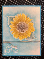
I used tim holtz distress watercolor paper. I'm not sure I like it with the intense pencils. The colored lines didn't want to blend out. After watercoloring I went back in an d added shadows. I added extra color around the flowers. I should have chosen a different image without the cluster fliwers. And the little sanil doesn't show up so well either
Date: Saturday, August 15, 2020 GMT Views: 295
Favorited:2
Registered: July 9, 2008 Location: Stars Fell on Alabama Posts: 74834
Sat, Aug 15, 2020 @ 6:36 PM
Such a pretty scene you created. I like your sky and grass...little snail, too. Good work with the w/c emboss resist.
------------------------------ My Blog---My Gallery---My PinterestI'm a Punchkateer! (Prez) FOREVERDirty Dozen Alumni2014 CAS Spring DT--- Inspiration Challenge Co- Hostess 12/02/17-12/28/19 Watercolor Wednesday Design Team Hebrews 13:2Brenda
Registered: October 19, 2007 Location: Packer Country, WI Posts: 72017
Sun, Aug 16, 2020 @ 5:16 AM
Very attractive with all your shading of colors. I agree with you, it does work better with a less detailed stamp. Happy you joined us for the challenge.
This is beawutiful! What a gorgeous scene. I have had that issue with intense pencils before. I love my Inktense but I struggle with getting the pigment to move so quite often I use a brush and take pigment directly from the pencil. However, I don't see harsh pencil lines on your card. You did a beautiful job on this!