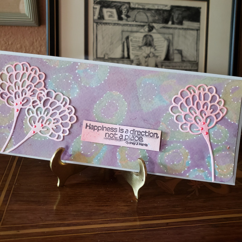
Of the two cards I made for this challenge, this background turned out the best. I used lighter colors and made sure the acrylic paint was quite sheer and very dry before adding the next layer.
I cut the sea flowers (actually I just like them because they're funky) from a piece from my stash, no idea what's on it. Used the same piece to stamp my sentiment with some shading. I used a Posca paint pen to put some dots around the circles and added a little Liquid Pearls in orange.
I hope you join me for this challenge. Thanks to Pat (pvilbaum) for telling me about it.
Date: Sunday, August 9, 2020 GMT Views: 614
Favorited:4
Splitcoast Dirty Dozen Splitcoast Challenge Host Proud Fan Club Member
Registered: April 11, 2016 Location: Posts: 30054
Sun, Aug 09, 2020 @ 10:18 PM
Love the soft effect you for with this one. Both are great cards. I’ll add this challenge to my list. I have the stash lol. TFS. Happy day
------------------------------ The Difference Between Try and Triumph Is Just A Little Ump Wednesday: Alpha Challenge
Thursday: Ways To Use It Challenge
Monthly: MMJ Challenge….get inky and have fun
Splitcoast Dirty Dozen Splitcoast Challenge Hostess Teapot Tuesday TEAm
Registered: June 3, 2016 Location: France Posts: 60412
Sun, Aug 09, 2020 @ 10:30 PM
I'm not sure I prefer this one, it's pretty too but I think I like the dark one more, I like the die cuts and sentiment and the highlights with the white dots are really fun!!
Splitcoast Dirty Dozen Alumni SCS Gallery Moderator Splitcoast Challenge Hostess Teapot Tuesday TEAm
Registered: July 27, 2007 Location: Dublin, Ireland Posts: 132004
Tue, Aug 11, 2020 @ 3:32 AM
Great sentiment, Jean. It's funny that you say you think lighter colours work better, whereas Anne decided that darker ones did. That flower die is super, and adding the dotted outlines to the circles in the background was a great idea.