I loved the nautical feel of her first one with the lighthouse and scene and used the summery colors and sandy shore from her second one.
This idea also sparked from both last week's Teapot challenge to use red, white and blue for a non-patriotic card and also from watching Brenda Quintana's video for CASEing Tuesday. These color are just perfect for my husband's cousin's son's graduation card. His school colors are this navy and red roughly. The CASEing part helped me with the layout and adding that touch of red in the BG, which I love. These ideas tied in so nicely with Chrysi's cards.
Date: Thursday, June 4, 2020 GMT Views: 1753
Favorited:6
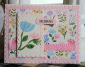
Ink: Real Red, Gray Granite, Pool Party, cool caribbean, Pacific Point, Garden Green, Granny Apple, Sahara, Versamark
Accessories: MFT Wonky stitched Rectangle dies, white EP, Classic label punch, candy dots, Up and Away dies (as a mask), blender brushes, HA stamp positiioner
Registered: April 14, 2006 Location: Knoxville, Tennessee Posts: 2158
Thu, Jun 04, 2020 @ 10:09 AM
Thank you for looking at my gallery! I love your card! It's perfect for a graduation card, because the beach denotes that summer and vacation feeling. Your colors are lvely! TFS!
Registered: June 4, 2009 Location: Deatsville, Alabama Posts: 82297
Fri, Jun 05, 2020 @ 3:29 AM
So pretty, Michelle. Love this set and you did a fab job with it (I can never do it). Great card. Hugz
------------------------------ Nancy Williams - Hope your day is Spirit-filled and ink-filled (in that order)!DRS Designs-DT, Punchkateerforever, Dirty Dozen Alumni