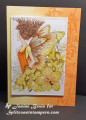
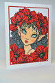
The stencilling on this is so pale you can't see it in the photo - it is on the yellow side. The orange side is stamped. DOX inks were used for sponging, stencilling and stamping. The main panel was printed and coloured with Copics. Stickles were added to the bubbles and the tips of the wings
Date: Friday, May 22, 2020 GMT Views: 793
Favorited:5
Splitcoast Dirty Dozen Alumni Proud Fan Club Member Splitcoast Challenge Hostess Teapot Tuesday TEAm
Registered: April 18, 2011 Location: Melbourne, Aus Posts: 51844
Fri, May 22, 2020 @ 4:33 PM
Your colouring is out of this world Janine and your card design is wonderful. The stenciling looks lovely, I love how subtle stenciling adds an extra element. Gorgeous card.
------------------------------ Susie
Please don't take your organs to heaven - heaven knows we need them here.
Splitcoast Dirty Dozen Alumni SCS Gallery Moderator Splitcoast Challenge Hostess Teapot Tuesday TEAm
Registered: July 27, 2007 Location: Dublin, Ireland Posts: 131535
Sat, May 23, 2020 @ 12:22 AM
Fantastic Spring colours, and so rich. There's some classical painting that it reminds me of in that richness, though the one I am thinking of is shades of green.
Registered: December 4, 2010 Location: Minnesota Posts: 16610
Sat, May 23, 2020 @ 12:57 PM
This is so stunning Janine- wow! I love your color choice for this card and your gorgeous fairy image. I do know how hard it is to stencil on yellow, but it is sooo pretty in real life. I really love all the sparkle and shine you added to your fairy image. ~Karen.