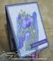
This card is for the current colour challenge: So Saffron, Balmy Blue & Early Espresso.
I substituted the SU inks for distress inks just because it was easier to blend with them and they were almost an identical match.
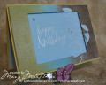
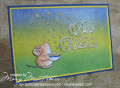
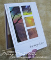
I got this inspiration from a Jennifer McGuire video found on her blog here: https://www.jennifermcguireink.com/2...echniques.html
I made quite a few mistakes and had to do some rescuing, mainly around the masking. I discovered that my masking fluid had dried up...due to lack of use and I had used up all my masking film. I ended up using some X-Press It stencil vinyl but it shifted off the little leaves and I ended up painting the blue back in with my Jo Sonja's acrylics.
I only stamped two of the images to begin with then realized I need three.
The other thing I would have done differently was to use either silver or gold embossing powder because I think it would stand out more. I didn't want to us black.
This technique makes two cards which is brilliant and it is quite easy to do. Jennifer's video is very comprehensive and is easy to follow although I did watch it three times and still missed bits.
Jennifer talks about different ways of masking and one that I hadn't thought of was to use your embossing pen and clear embossing powder. It will give a gloss effect but the colour of the card stock will still come through, brilliant.
Pop on over to Jennifer's blog (link above) and give it a go.
Thanks for looking
Date: Sunday, January 12, 2020 GMT Views: 786
Favorited:3
Registered: April 16, 2008 Location: Meridian, Idaho Posts: 8507
Sun, Jan 12, 2020 @ 10:10 PM
I saw that video and I think your take on both cards is spot on and totally gorgeous, Marg! All the sparkle drew me in plus your beautiful use of the spotlight technique. Stunning cards and I'm so very happy you joined the Color Challenge this week! You've been missed!
------------------------------ Stef
Splitcoast Color Challenge Design Team Splitcoast Dirty Dozen Alumni