Registered: March 8, 2005 Location: Halfway between Dallas and Houston Posts: 24019
Fri, Aug 10, 2018 @ 10:21 AM
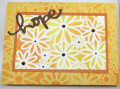
The difference in brightness that you got from sponging on two different base colors is a great contrast for the layers of your card! The white really makes the focus layer pop while the yellow fades into the background somewhat. Guess it should - It's a background, haha.
------------------------------ Proud Fan Club Member
Dirty Dozen Alumni
"Art washes away from the soul the dust of everyday life."
Registered: June 4, 2009 Location: Deatsville, Alabama Posts: 83521
Sat, Aug 11, 2018 @ 4:45 AM
Super pretty colors, so bright and cheerful and fun. Love the stencil you used too. Great card, Sharon.
------------------------------ Nancy Williams - Hope your day is Spirit-filled and ink-filled (in that order)!DRS Designs-DT, Punchkateerforever, Dirty Dozen Alumni
Registered: December 4, 2010 Location: Minnesota Posts: 16610
Sun, Aug 12, 2018 @ 9:36 AM
What a happy card this is Sharon. I love the colors you used and the 2 different masking techniques for the background and the front panel. This is going right into my favs! ~Karen.