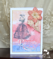
This was my first and only attempt and I like the technique. Not sure that the image on the left was supposed to be so vague, maybe I got too much alcohol there. It looks like batik and since I love batik, I'm happy with it.
Date: Monday, July 9, 2018 GMT Views: 553
Favorited:2
Splitcoast Dirty Dozen Alumni SCS Gallery Moderator Splitcoast Challenge Hostess Teapot Tuesday TEAm
Registered: July 27, 2007 Location: Dublin, Ireland Posts: 132001
Mon, Jul 09, 2018 @ 2:48 PM
Grins, I had no idea whether I was meant to be going for slight blurring of the stamped image or not. I guess the whole thing is it really doesn't matter! I like the soft effect of yours. It's a brilliant sentiment to use with the soft, dreamy look of your background panel.