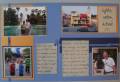
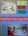
Revamped pages. I still think it is bland even after adding ribbon and tags. Still open to suggestions.
Here is the first attempt Gallery at Splitcoaststampers
Date: Wednesday, May 24, 2006 GMT Views: 314
Favorited:3
Additional Info
Stamps: Pure and Simple Upper Alphabet Canvas
Paper: Bashful Blue Brillany Blue Really Rust Red Red Confettie White
Registered: December 13, 2004 Location: SHHH- it's a secret Posts: 286
Fri, May 26, 2006 @ 1:45 PM
looks good- if you want to add more try adding some shapes behind the photos either with simple shapes or cut outs in red or a shade of blue....Nice balance of photos on this one! Good stampin' girl!
------------------------------ is Ben and Jerry's a diet food?


 The tags are perfect!


