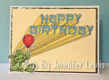
Wicked fun technique today. But aren't they all? This is the kind of technique that I would've skipped before I got my ScanNCut. I don't have many word dies and the ones I have I don't really like. So I designed the cut file using the "Baveuse" font that was a freebie recently at the Hungry JPEG. The technique was challenging and I have some ink smudges but it was fun and made a cute card. It reminds me of the seventies. Like a screen shot from a School House Rock cartoon. I've also combined this with this week's Bugaboo Color Challenge. I've used all the colors but the pinks because I wanted this to be a more masculine card. Can't wait to check out this gallery!
Date: Monday, February 26, 2018 GMT Views: 701
Favorited:4
Splitcoast Dirty Dozen Alumni SCS Gallery Moderator Splitcoast Challenge Hostess Teapot Tuesday TEAm
Registered: July 27, 2007 Location: Dublin, Ireland Posts: 131503
Mon, Feb 26, 2018 @ 7:45 AM
Eep, this is adorable! It certainly has a great masculine feel - there's something sort of space-exploration about the dimension and the lettering. And the little dragon is just so cute.
Registered: February 23, 2016 Location: El Paso, TX Posts: 22818
Mon, Feb 26, 2018 @ 8:36 AM
That cute little dragon is just radiating his birthday wishes! I applaud your industrious spirit in working on a double word -(I had enough trouble with just one) Well done connecting all the "dots"!
------------------------------ Linda aka Bubbles
I'm not a Hoarder . . . I'm the Curator of an extensive collection of embellishments!!
Proud Fan Club Member Guest Designer Color Challenge July 2017 Favorites Notification Team