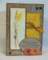
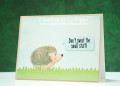
The hardest part of this card was choosing my Distress ink colors! I started with the Victorian Velvet, mostly because I hardly ever use it. I went with a more muted palette then, choosing Shaded Lilac instead of the Faded Jeans I first picked out, just to shake up the triadic color scheme I seemed to be building. I cut my panel of bristol paper to A2 size, and taped off 1/8" on all sides. I marked the horizontal center on the tape, so I didn't have any pencil lines on my panel. I inked up my block with the Fossilized Amber first, spritzed it with water, and stamped it on my panel. I did the same with the Shaded Lilac & Victorian Velvet. After I dried that with my heat tool, I stamped one of the flowers in Versafine a total of 3 times to get a good black image. I dried that with my heat tool, and then stamped the greeting. I trimmed off 1/8" from each side of my panel, matted it with black, and adhered it to my white card base. I love the drama of the black against the white & muted colors!
Date: Monday, October 30, 2017 GMT Views: 793
Favorited:4
Registered: December 8, 2005 Location: Iowa Posts: 72984
Thu, Nov 16, 2017 @ 7:11 AM
Love, love, love your color choices! This is beautiful!
------------------------------ Paula "The way I see it, every life is a pile of good things and bad things. The good things don’t always soften the bad things, but vice versa the bad things don’t always spoil the good things, or make them unimportant. - The Eleventh Doctor


 I started with the Victorian Velvet, mostly because I hardly ever use it. I went with a more muted palette then, choosing Shaded Lilac instead of the Faded Jeans I first picked out, just to shake up the triadic color scheme I seemed to be building. I cut my panel of bristol paper to A2 size, and taped off 1/8" on all sides. I marked the horizontal center on the tape, so I didn't have any pencil lines on my panel. I inked up my block with the Fossilized Amber first, spritzed it with water, and stamped it on my panel. I did the same with the Shaded Lilac & Victorian Velvet. After I dried that with my heat tool, I stamped one of the flowers in Versafine a total of 3 times to get a good black image. I dried that with my heat tool, and then stamped the greeting. I trimmed off 1/8" from each side of my panel, matted it with black, and adhered it to my white card base. I love the drama of the black against the white & muted colors!