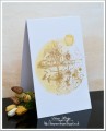
I've seen the sepia cards and love them. I had the idea to do City of David, but I think I need help on making it better. Appreciate any suggestions!! I've done 20 and will be doing 80 more for Christmas.
Date: Monday, October 23, 2017 GMT Views: 4355
Favorited:8
Registered: February 3, 2005 Location: Delray Beach, FL Posts: 34769
Mon, Oct 23, 2017 @ 2:30 PM
Hi, Donna, and congratulations on a lovely card to start your gallery! I love this sweet stamp set and love how you've used bleach to add white to the watercolor paper! Hope to see your gallery grow!! Hugs!
------------------------------ Cheryl
Proverbs 3:5-6 My blog
Splitcoast Dirty Dozen Alumni Proud Fan Club Member Splitcoast Challenge Hostess Teapot Tuesday TEAm
Registered: April 18, 2011 Location: Melbourne, Aus Posts: 51844
Mon, Oct 23, 2017 @ 3:06 PM
Welcome to the galleries Donna. I love your design and technique. You must have the patience of a saint to do 80 more backgrounds. I wonder if it would look just as effective using Kraft cardstock. It might be worth a try.
------------------------------ Susie
Please don't take your organs to heaven - heaven knows we need them here.
Registered: May 25, 2006 Location: So. Oregon Posts: 121528
Mon, Oct 23, 2017 @ 3:37 PM
Congratulations on starting your gallery.
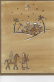
are you intending to add a sentiment (greeting?) to the front cover? ( It looks like you could maybe squeak one in catty corner above right off set from the family below the city? ( maybe play around with your stamps on scrap paper and see if one will work?
I think the scene is great and I love how the white pops.
Registered: September 12, 2004 Location: Redmond, Washington Posts: 54452
Mon, Oct 23, 2017 @ 3:44 PM
I love the clean simplicity of the design, especially if you are doing 80 more Maybe a very small sentiment under the lone palm tree/hill like Stacy mentioned. Your card is really lovely, conveying the true meaning of Christmas.
------------------------------ This is the day that the Lord has made. Let us rejoice and be glad in it.
Splitcoast Dirty Dozen Alumni SCS Gallery Moderator Splitcoast Challenge Hostess Teapot Tuesday TEAm
Registered: July 27, 2007 Location: Dublin, Ireland Posts: 131334
Mon, Oct 23, 2017 @ 11:15 PM
I like the monochromatic look! 80 on watercolour paper is going to be expensive, I confess I'm more frugal with mine, and I'd agree with Susie's suggestion of using a pale kraft cardstock.
I would make the image panel a little smaller and mat it on black card or even just edge it with a black pen...or else I would have it the full size of the card front and doodle a border all round.
P.S, I see somehow it's in the Christmas Classics gallery. I know we have one for City of David, I'll move it there where I am sure others will be inspired by it.
Splitcoast Dirty Dozen Splitcoast Challenge Hostess Proud Fan Club Member
Registered: January 27, 2010 Location: Southern Ontario, Canada Posts: 51650
Tue, Oct 24, 2017 @ 5:59 AM
Lovely - I agree with Sabrina (Cook) that watercolour paper could get costly and think it would be just as fabulous on kraft paper. For 80 more cards I sure hope you have a MISTI.
Splitcoast Dirty Dozen Splitcoast Challenge Hostess Teapot Tuesday TEAm
Registered: June 3, 2016 Location: France Posts: 59551
Tue, Oct 24, 2017 @ 8:19 AM
wow 100 cards and all the same...that's nothing for me...It would be boring me very quickly
but your design is very beautiful I would add a sentiment too