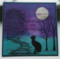
I made this card for this week's color challenge which uses the colors of Bermuda Bay, Night of Navy and Rich Razzleberry. My goodness, this challenged me - BIG TIME! It is quite cool here today in Minnesota so I decided to do a fall card in nontraditional colors. This really is a big stretch for me, but I had so much fun doing this so I do appreciate this color combination a lot. This stamp set has a solid image and an outline image to it. For each leaf, I used the solid image only and placed it in my MISTI. Then I took 2 sponges using Rich Razzleberry and Dapper Denim inks I sponged the color onto the stamp where I wanted it. I sponged and stamped each leaf 3 times to get the color intensity that I wanted. Then I fussy cut each leaf out so I could have die cuts for the dessert portion of this challenge. Gotta love dessert, right? Still, I was struggling how to fit the Bermuda Bay into this scene. I decided to stamp the acorn in Bermuda Bay and it is so darned cute in real life. Then I did some very light shading behind the leaf cluster in Bermuda Bay and that brightened up the whole card. Whew! Thanks for looking today. ~Karen.
Date: Tuesday, October 10, 2017 GMT Views: 2700
Favorited:10
Registered: January 6, 2004 Location: Connecticut Posts: 20543
Tue, Oct 10, 2017 @ 1:40 PM
I don't think I would have thought to choose these colors for an autumn card, but wow! This just pops in the gallery. Wonderful card in this week's colors!
------------------------------ Rediscovering the simple joy of stamping and exploring my art! Stamp your ART out! Share your thoughts. Let your heart sing.
Come check out my Gallery and leave a comment!
FS465
Registered: March 13, 2011 Location: Langley, B.C. Canada Posts: 32126
Tue, Oct 10, 2017 @ 2:51 PM
Ooh, Karen, this is spectacular. Love your idea of using the challenge colors for a fall card. You totally rocked the color challenge with this one, my friend.
Registered: October 21, 2010 Location: in the okanagan in b.c. canada Posts: 13012
Tue, Oct 10, 2017 @ 2:55 PM
wow for being out of your norm you did fabulous....love how you got the colors so deep and rich and the sponging like you say popped things out...I bet IRL its gorgeous even more...I know the camera never comes close to showing the beauty...but came close here..LOVE it...TFS..:0)
------------------------------ We as people are raindrops of colorful ink , falling down Crisp and Clear, each a different shade more vibrant then the last, but once we realize at the bottom of an endless abyss we all fall into the same inkpot forming one color, only then can we come together as one My son.
Registered: April 16, 2008 Location: Meridian, Idaho Posts: 8507
Tue, Oct 10, 2017 @ 8:20 PM
You did such an amazing job with these colors! I love how you didn't shy away from the color vibrancy even you were not comfortable with the combination. Saving the Bermuda Bay for the acorn was a brilliant strategy as it just POPS against the darkers colors.
Beautifully done!
------------------------------ Stef
Splitcoast Color Challenge Design Team Splitcoast Dirty Dozen Alumni