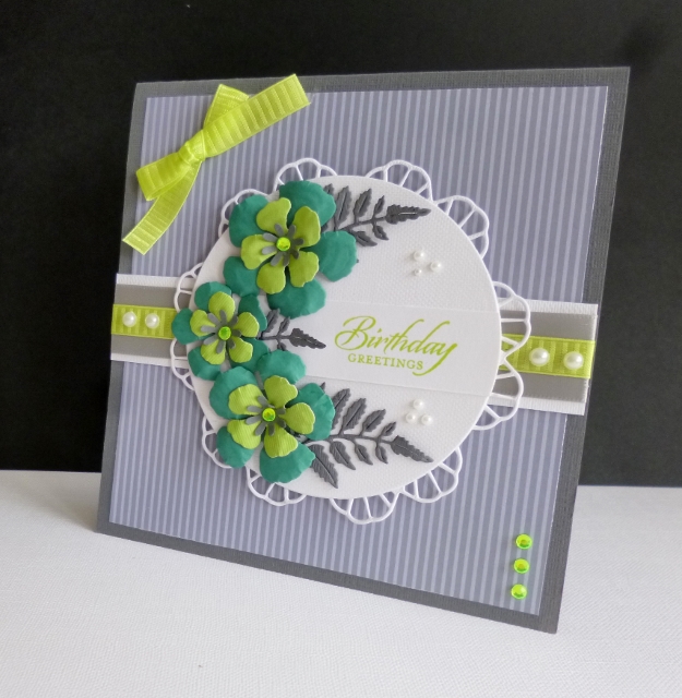
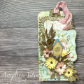
My DH has been in hysterics this morning, watching me hauling cardstock galore out of drawers, holding it up to the computer screen, while asking ''Is it a match?'' Anyway, I have some grey, but I subbed the others - official colours if you have them are: Basic Grey, Bermuda Bay, & Lemon Lime Twist.
I put a square of SU dsp on the grey base, added ribbons to a white panel and placed in the centre. I put a large die cut circle over the doily die, just letting the frill show. I shaped the blossoms with a ball tool and foam mat, glued them together and added some ferns in grey. I punched tiny flower centres and added a lime gem to each. A few SU pearls, more faux gems and a bow to finish.
TFL
Date: Tuesday, August 22, 2017 GMT Views: 1461
Favorited:6
Registered: October 30, 2007 Location: Posts: 26718
Tue, Aug 22, 2017 @ 5:38 AM
Great job on matching the colors and I LOVE your card! The gray bg is so perfect for toning down the bright colors, and your flower spray is fabulous - faved!
Registered: November 24, 2013 Location: NYC Posts: 17682
Tue, Aug 22, 2017 @ 5:40 AM
it is a nice color combo. Not one I would have thought of.
And an orientation I would not have thought of-I probably would have the leaves pointing up.
One of the things I love about your work. You make me think
------------------------------ Margot
I am a proud fan club member
Registered: January 20, 2016 Location: Freetown, Massachusetts Posts: 31434
Tue, Aug 22, 2017 @ 1:15 PM
I was expecting you to say these colors were out of your comfort zone too and I was going to tell you no way because you rocked these colors! I love love love this fabulous card!