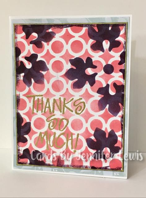
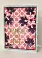
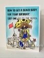
Karen might not think so, but she gave us really lovely colors today. But colors I would never ever think to use together. So I've paired this difficult color challenge with the TLC challenge to use two different stencils. And these two inks just look beautiful together. My only problem was that I don't have an ink that's close to Soft Sky and couldn't come up with a way to get the Soft Sky into the main panel. So I snuck in the Soft Sky as a DP to frame up the main panel.
Splitcoast Dirty Dozen Alumni Splitcoast Challenge Hostess The Charmed Life
Registered: November 19, 2005 Location: Bethel Park, Pa Posts: 37265
Tue, Jun 27, 2017 @ 11:31 AM
you made a great background with these colors Jen- nice work for both challenges-
just an fyi: for the color challenge you can use either the inks or the cardstocks or a combo of both- or embellishments that are the challenge colors.
------------------------------ Mary Marsh SCS Color Challenge DT Coordinator My Blog- The Charmed Life
Registered: February 5, 2007 Location: St. Louis, MO Posts: 92694
Tue, Jun 27, 2017 @ 12:04 PM
Great card to link the two challenges, Jen. The blue back panel was a good solution as to how to get that soft blue into your card. The main panel is lively and bright......a stunning card.
Registered: February 23, 2016 Location: El Paso, TX Posts: 23018
Tue, Jun 27, 2017 @ 4:33 PM
Nothing wrong with using one of the colors as framing - I think alot of people worked with 2 main colors today and used the 3rd for accent. Your 2 stencils and colors look great together!
------------------------------ Linda aka Bubbles
I'm not a Hoarder . . . I'm the Curator of an extensive collection of embellishments!!
Proud Fan Club Member Guest Designer Color Challenge July 2017 Favorites Notification Team