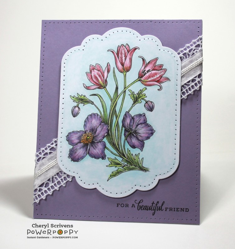
Hello, lovely friends! It's time for another card from me, and I finally got into high gear and colored. Some days are harder than others, and my vision is still a bit blurry (which makes coloring a bit challenging...so a few extra blinks can help). But I was able to color up the newest Power Poppy digital image. I pulled in one of the two images of this new release and colored it, die cut it, and paper pierced around it. The layout is always a dilemma for me, so I ended up using some lace with seam binding and Perle cotton on a diagonal. I used my Mini MISTI to add the sentiment on the base of the card, added the lace/ribbon treatment, and then used thin foam pads to mount my focal image on the card. Oh, I did add some Wink of Stella for some glimmer...and then it was done.
As always, thank you so much for taking a closer look at my card, and I hope you have a wonderful rest of the week! You are all so special to me, and I've missed you all a lot. I hope to post another card soon...who knows...maybe another one yet in April? Ha! Hugs, all!
Stamps: Sunset Sway, Burst of Kindness (Power Poppy)
Paper: X-Press It Blending Card, Winter Wisteria (PTI), white (Bazzill)
Paper Size: 4�" x 5�"
Ink: Onyx Black (Versafine), Printer
Accessories: Copic markers, Grand Labels 11 (Spellbinders), Mini MISTI tool, paper piercing tool, Mat Pack piercing guide (SU!), lace (May Arts), seam binding (Hug Snug), white Perle cotton (DMC), Wink of Stella, Thin 3D Foam Squares (Scrapbook Adhesives), red tape
Techniques: Digital images using Microsoft Word, paper-piercing
Splitcoast Dirty Dozen Alumni Favorites Team Notifier Splitcoast Challenge Hostess
Registered: October 26, 2009 Location: Oakhurst, near Yosemite Nat'l Park. Posts: 46806
Wed, Apr 19, 2017 @ 7:26 AM
OMGoodness Cheryl, this is stunning! This is so gorgeous! I LOVE your diagonal beautiful ribbon and your image is so so gorgeous plus your coloring of it, wow! Beautiful work my dear friend, just beautiful!
------------------------------ Blessings, Robin Encourage one anotherMy Blog-InkMagination , QFTD201,Dirty Dozen Alumni.Impression Obsession DT, ECraftDesigns DT, Formerly HC DT, ODBD DT, DRS DT
Registered: February 5, 2007 Location: St. Louis, MO Posts: 92578
Wed, Apr 19, 2017 @ 12:16 PM
Your coloring is SO perfect that it looks like a botanical print, Cheryl. Just exquisite. You must be Power Poppy's best ambassador! They are so lucky to have you on their team.
Registered: May 31, 2009 Location: East Tennessee enjoying the mountain views Posts: 32997
Thu, Apr 20, 2017 @ 10:34 AM
Absolutely gorgeous Cheryl, your coloring is always spot on and this is no exception.... and I do love the simple layout.... It is the perfect way to showcase the flowers.
Registered: November 19, 2004 Location: Lutz, FL Posts: 15938
Fri, Apr 21, 2017 @ 2:26 PM
Beautiful, Cheryl! (and the card's really nice, too!) I always shy away from purples as a primary color - but, wow, you sure can make purple pretty. Love this!
------------------------------ Debbie
Featured Stamper 283
Registered: October 30, 2007 Location: Posts: 26718
Sat, Apr 22, 2017 @ 9:47 PM
Exquisite coloring as always, Cheryl, and I love your layout! The diagonal element is so eye-catching! Faved, and I am looking forward to another card in April!!