* Replaced with better photo after assembling onto a card front.
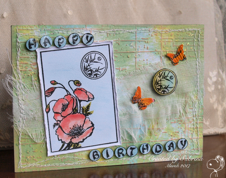
For Judy's TLC this week - TLC628 Direct to Paper.
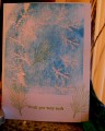
I often do faux wood and faux denim with browns and blues. When I was trying to think of how to create a soft background for my poppy ATC image, I thought that using soft colours would work well and it did. It looked quite fine just as it was, but then I embossed it and wiped over it with Tattered Rose just for a bit more colour. Added some frayed cheesecloth and stitched all round the edges.
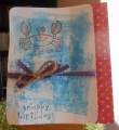
The image panel, I scraped blue chalk pastel over the background and brushed it in, then coloured the poppy with distress re-inkers. Plan A was to add the coloured circle back into the main image, but I decided I liked it better to one side - and given that I'd coloured it first, how well it matches the background! I added some little groups of Stickle dots to the background too.
The spacing between the letters on a vertical sentiment gave me enough space to punch them out (I had to stamp it twice - then I edged them with a black pen, went over them with a glitter pen and finally added Glossy Accents. They're popped up on foam dots.
The two little orange butterflies are cut from the first image panel I coloured in - loved the colours but in trying to rub an excess of chalk off I also rubbed my still damp poppies and pilled the paper. Still, it works fine for die-cutting .
This is still just a card-front as I only got home from work barely in time to rush upstairs, grab it and take a photo without even taking my coat off before the daylight was gone. And I'm out all day tomorrow...
Date: Wednesday, March 8, 2017 GMT Views: 595
Favorited:2
Registered: January 8, 2011 Location: Sydney, Australia Posts: 40416
Wed, Mar 08, 2017 @ 8:51 PM
Wow, Sabrina, there you go creating one of your amazing bgs again, love the pretty soft colours on this!! This is one gorgeous card with the pretty poppies, cheesecloth and butterflies!!
------------------------------ Sue
Fan Club Member QFTD143 FS420


 .
.