F4A365 = use Pantone "in colors" for spring to choose a palette that must include "Greenery".
This card is also for PTI Anniversary 2013 Challenge.
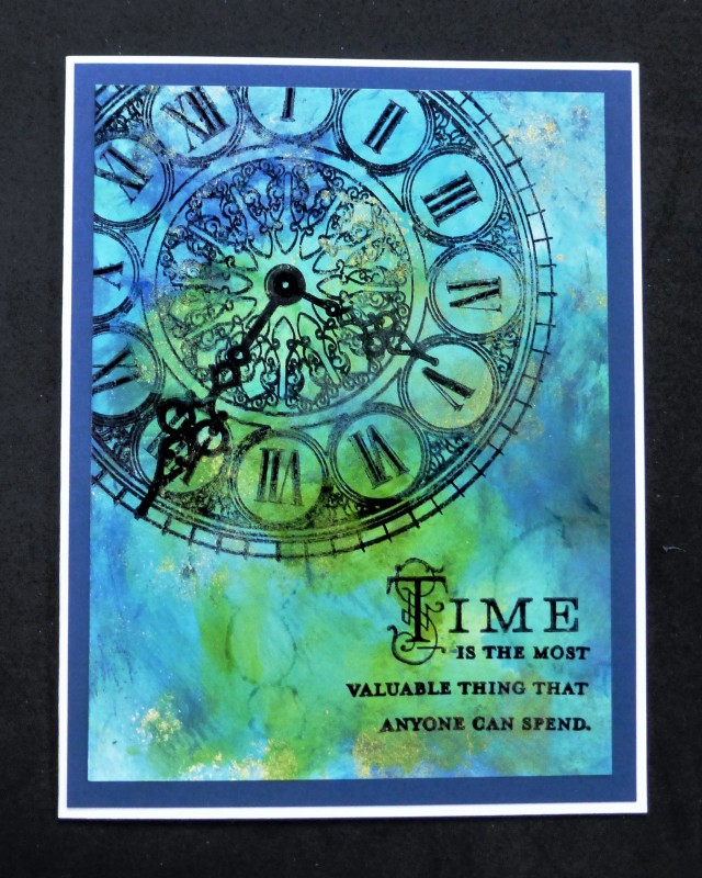
I used Tim Holtz alcohol inks in colors that were close to those given in the chart. The Pantone colors were: Greenery, Island Paradise, Niagara, and Lapis Blue. After the bg was done, stamped all the other elements with Stazon black.
TFL
Date: Friday, February 17, 2017 GMT Views: 1175
Favorited:12
Registered: December 15, 2011 Location: Abilene TX Posts: 11275
Fri, Feb 17, 2017 @ 5:58 AM
Beautiful background for that gorgeous stamp and wonderful sentiment!
------------------------------ JodyLynn - "Love me - love my cats!" DTGD12, DTGD14, HYCCT12, HYCCT13, HYCCT14, HYCCT15, Love Fest 2013, Love Fest 2014 CAS and CC guest designer QFTD 258
Registered: July 9, 2008 Location: Stars Fell on Alabama Posts: 75072
Fri, Feb 17, 2017 @ 7:26 AM
Beautiful colors using your alcohol inks, Sallie. Fab card!
------------------------------ My Blog---My Gallery---My PinterestI'm a Punchkateer! (Prez) FOREVERDirty Dozen Alumni2014 CAS Spring DT--- Inspiration Challenge Co- Hostess 12/02/17-12/28/19 Watercolor Wednesday Design Team Hebrews 13:2Brenda