Registered: October 21, 2010 Location: in the okanagan in b.c. canada Posts: 13012
Wed, Sep 28, 2016 @ 1:26 PM
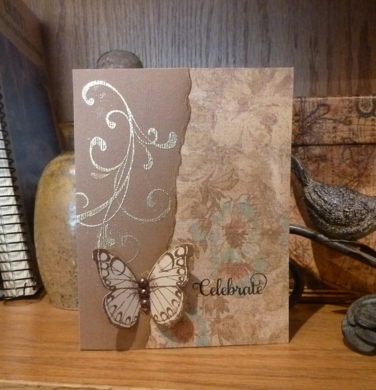
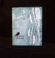
So pretty love the gold and your butterfly delicately sitting for a break. TFs..:0)
------------------------------ We as people are raindrops of colorful ink , falling down Crisp and Clear, each a different shade more vibrant then the last, but once we realize at the bottom of an endless abyss we all fall into the same inkpot forming one color, only then can we come together as one My son.
Registered: April 16, 2008 Location: Meridian, Idaho Posts: 8507
Wed, Sep 28, 2016 @ 1:58 PM
Oh swoon, I LOVE your card! The flourish is a lovely next to the subtle floral print of the dsp, and the butterfly is such a clever idea for the shape on the sketch. So, so pretty!
------------------------------ Stef
Splitcoast Color Challenge Design Team Splitcoast Dirty Dozen Alumni
Registered: March 31, 2008 Location: Eastlake, OH Posts: 22598
Wed, Sep 28, 2016 @ 4:45 PM
You always use the most gorgeous colors and I am particularly fond of the neutrals! How great that flourish looks embossed on textured paper! What beautiful paper too! Fabulous design, Jo!
Registered: October 12, 2007 Location: Arizona Posts: 70176
Wed, Sep 28, 2016 @ 5:49 PM
Loveliness in neutrals. Beautiful take on the sketch. I like the torn edges, the swirls, the subtle hint at a blue color and the pretty butterfly. Nicely done. TFS