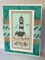
I like this sketch. It came together pretty quickly for me. I did cheat a little by skipping the sentiment, because when I saw the sketch I thought of this lighthouse with the shells at the bottom. TFL!
Date: Wednesday, September 7, 2016 GMT Views: 593
Favorited:4
Registered: February 23, 2016 Location: El Paso, TX Posts: 22902
Wed, Sep 07, 2016 @ 5:50 AM
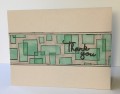
Great masculine card especially with the addition of the burlap. I think the shells are a great sub for a sentiment. I often like to leave the front senitment free - that way when the need arises it can be turned into whatever you need depending on the sentiment inside!
------------------------------ Linda aka Bubbles
I'm not a Hoarder . . . I'm the Curator of an extensive collection of embellishments!!
Proud Fan Club Member Guest Designer Color Challenge July 2017 Favorites Notification Team
Registered: June 29, 2004 Location: Sugar Land. Texas Posts: 79591
Wed, Sep 07, 2016 @ 7:36 AM
Love your colors, the theme of your card, and that burlap is a great addition.
------------------------------ LizThe joy of the LORD is my strength.Right Brain Madness --My blogProud member of the redDivasKSS certified multi-step stamperFan Club member since 2004
Registered: August 21, 2007 Location: Wayland MA Posts: 105182
Wed, Sep 07, 2016 @ 11:23 AM
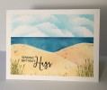
I'm glad you skipped the sentiment...the shells look wonderful. Love the blue........the color of the water in Bermuda........not so much the water here in NE!!
------------------------------ Anne HarmonFS154, QFTD58, PROUD FAN CLUB MEMBER (photo of our Great Granddaughter Elise, just 6 months old) and me, even older.
Registered: October 12, 2007 Location: Arizona Posts: 70346
Wed, Sep 07, 2016 @ 11:33 AM
Wonderful take on the sketch. Love, love the colors. The lighthouse and ocean theme is awesome. The burlap goes wonderfully with everything. Fabulous card. TFS