I really wanted to be brave enough to attempt the challenge Alternative Inspiration Video #3, but I didn't quite have any die that would work out as cool as that. So I decided to just focus on having "repetitive shapes" in the shaker.
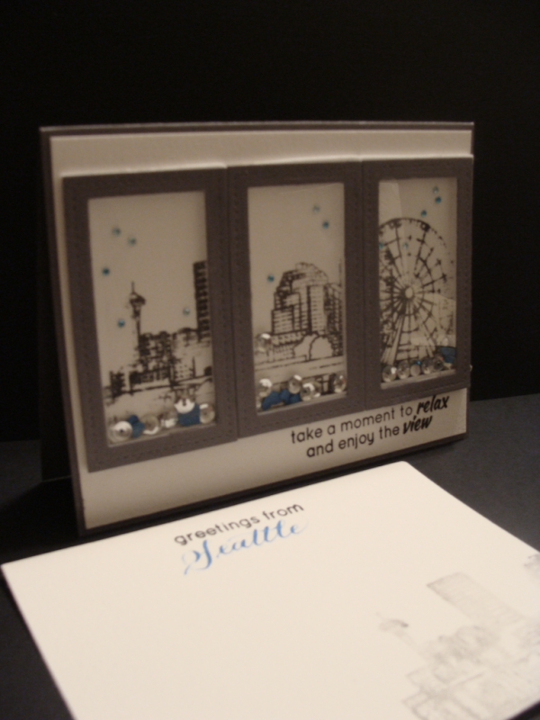
Lately many modern new construction homes have beautiful ceiling to floor windows, delivering fabulous panoramic views! So I chose to be inspired by that modern look for my shaker card design. I punched out a few tiny blue hearts to go with my sequins, and adhered a few of the tiny blue pearls that Susan R. sent me so that even when you didn't shake it, it would still look like rain (we drizzle quite a bit here). On the inside panel I watermarked part of the city scape, and added 'greetings from' from the stamp set, and then hand penned 'Seattle" for a personal touch. The envelope has the same city scape as the inside panel. I love how it turned out (sorry the picture is a bit dark....darn camera!)
Aren't you AMAZED at all the shaker card designs in this gallery!? I totally am impressed with the creative uploads - many of which I've fav'd to CASE later on (shhh - don't tell)!
Big swishy hugs!
Audrie
Date: Monday, May 30, 2016 GMT Views: 822
Favorited:0
Registered: August 15, 2007 Location: Twin Cities MN Posts: 50473
Tue, May 31, 2016 @ 5:30 AM
Audrie this is brilliant! I love the idea of a tri-shaker card. This works beautifully for a cityscape. Love the monochromatic color scheme, too and the hint of blue in the shaker bits. Very cool!
Registered: March 31, 2008 Location: Eastlake, OH Posts: 22598
Tue, May 31, 2016 @ 8:15 PM
Audrie, I LOVE this! I have always struggled with shaker cards. You have a triple panel and did a beautiful job with this including your image choices. Love the sequins you used too. I just love the neutral color with a hint of blue!