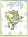
I have issued a personal challenge to myself in recent months to try and use my SU items especially stamps and ink for my scrapbook layouts. Here is my first 99.8% SU page (ribbon was non SU but I dyed it to match using classic ink pad) and font was non SU.
I would truly welcome comments on ways I could improve upon this.
ETA: I just noticed that the photo is a wee bit crooked - I will have to fix that.
Thanks,
Sharon
Date: Saturday, April 29, 2006 GMT Views: 578
Favorited:3
Registered: March 26, 2003 Location: Bothell, WA Posts: 1142
Sat, Apr 29, 2006 @ 9:30 AM
Great page! The only think I can possibly think of to change it at all would be to double mat the photo with a contrasting color. I've heard (note that I haven't done this much myself) that if you use more than one mat for things, they should vary in width for visual appeal. For instance, if your 1st mat shows 1/8" around your photo, the 2nd mat should either show more or less than that, but not the same. I hope this makes sense.
Also...please know I'm not saying you should change your page at all - I love it!
Registered: February 27, 2005 Location: DFW, TX Posts: 508
Sat, Apr 29, 2006 @ 10:28 AM
Klogan- Yes I think you are right . I could maybe add another mat layer of certainly celery or old olive for a little "pop". I might do that when I take the picture off to straighten it.
Thanks,
Sharon
------------------------------ Sharon Celebrating life one photograph at a time.